
Tuesday, January 19, 2010
Monday, January 18, 2010
WEB DESIGN 2--Redesign Commercial Website
Project Definition
In this project, I am going to redesign a commercial website which is given by lecturer not randomly--website of PAPPARICH Restaurant in Malaysia(www.papparich.com.my). We need to find out the problems or which part we need to improve it, to make it more attractive and can let the audience feels like want to go there to have a meal after go through the website. Means I need to re-brand it. We are given 8 weeks to finish this project, includes at least 8 pages of design and coding.
Current Site's Analysis Goals
Client's Analysis
Background
According to my research, PappaRich was established in 2006 with the opening of its first PappaKopitiam in Selayang Mall. PappaRich is PappaKopitiam all grown up; today it has over 29 outlets in the Klang Valley under the brand of PappaRich and is beginning to emerge as a formidable player in the local food and beverage chain. Unique Selling Point
Their unique selling point is the traditional food in Malaysia such as cafe, coffee, nasi lemak, roti kaya and so on. Based on this concept, their package will be more on Southeast Asian style.
Short and Long Term Site Goals
Short
Increase the hit rates, maybe design the interactive part more interesting to let the audience keep visiting this website.
Long
To build up a well-relationship between the company and users or customers, confidence and trust from the customers, make sure their will come back or continue supporting the company.
Target Audience
Competitor's Analysis
In this project, I am going to redesign a commercial website which is given by lecturer not randomly--website of PAPPARICH Restaurant in Malaysia(www.papparich.com.my). We need to find out the problems or which part we need to improve it, to make it more attractive and can let the audience feels like want to go there to have a meal after go through the website. Means I need to re-brand it. We are given 8 weeks to finish this project, includes at least 8 pages of design and coding.
Current Site's Analysis Goals
- need to be more consistency in every page, especially the position of navigation bar, and the art direction or art-style.
- the menu page maybe can be more interesting rather than full words in 1 page.
- can put more description of each images in events page.
- apply interesting content.
- can update some latest events in front page.
- apply an interesting layout design to attract audience, maybe can add on some animation?
- can be more user friendly
- art-style can be more on Malaysian identity.
Client's Analysis
Background
According to my research, PappaRich was established in 2006 with the opening of its first PappaKopitiam in Selayang Mall. PappaRich is PappaKopitiam all grown up; today it has over 29 outlets in the Klang Valley under the brand of PappaRich and is beginning to emerge as a formidable player in the local food and beverage chain.
The popularity of its cafe is attributed largely to the introduction of food which are all-time favourites such as freshly-baked bread and buns, the traditional toast with kaya and butter, nasi lemak, fried kuey teow, curry laksa, asam laksa, chicken rice, prawn mee, cendul, ice kacang etc, all available at affordable prices and prepared with the freshest ingredients and in its original flavour and taste.
In addition to its fresh food, it also offers the choice of excellent coffee to its patrons. The green beans are imported from the best in Africa, South America, Hawaii and Indonesia. The same coffee is served in leading hotels, restaurants and reputable retail outlets in Singapore.
Their unique selling point is the traditional food in Malaysia such as cafe, coffee, nasi lemak, roti kaya and so on. Based on this concept, their package will be more on Southeast Asian style.
Short and Long Term Site Goals
Short
Increase the hit rates, maybe design the interactive part more interesting to let the audience keep visiting this website.
Long
To build up a well-relationship between the company and users or customers, confidence and trust from the customers, make sure their will come back or continue supporting the company.
Target Audience
- primary target audience are those working people which are between 25-40 years old.
- A family or a group of friends is also considered as part of main target audience.
- middle to high income is more available.
- teenagers between 17-25 years old who can handle their way of using money nicely.
Competitor's Analysis
The primary competitor is those high class local brand restaurant such as Old Town. Old Town has the same concept with Papparich which is providing local traditional foods with higher prices compare to normal Chinese restaurant. But, they have a very nice website layout design; compare to Papparich website, Old Town’s website is more attractive and successful to promote their things even make more audience feel like want to have a meal in their restaurant. Their advertisement is also very successful.
The secondary competitors are those normal Chinese restaurant which are having a cheaper prices compare to Papparich. So, those who want to save their money will go to these restaurant rather than Papparich. So, want to have more customers, Papparich might have some special advertisement, promotion, and also a attractive website design to attract more people go their restaurant.
Thursday, January 7, 2010
WEB DESIGN 2--Redesign Website
In this short sem, we are required to be more professional in doing or creating our project, treat our project like what we will do for our clients in future. So, although it is a short sem, but actually not that relax as well.
In WEB DESIGN 2, our final project is about redesign our client's website which is chosen unluckily...hehehe...my client is PAPPARICH, a restaurant in Malaysia. I need to redesign their website by solving the problems in their website.
Here I will post some screen shorts of their website.


 problems should be solved:
1. navigation bar in each page is not consistency and the design is too simple.
2. overall color mood and art style is not match with their theme.
3. there is no title in each page.
4. no hierarchy in each page, either the images or paragraph.
5. Menu page is very messy, make the audience no more mood to continue reading.
_____________________________________________________________
competitor's website:
Oldtown
www.oldtown.com.my
Analysis: overall mood is very nice, design is very eye-catching, artstyle looks very class but modern, information is organized nicely.


Avista Restaurant
www.avistarestaurant.com
analysis: design simple but very nice, looks high class, layout designed nice, the organization of the information is very well.


Firewater Cafe
firewatercafe.net
analysis: layout design is simple but nice, hierarchy of information or each paragraph is well-organized, color mood is there.


Camilles Cafe
www.camillescafe.com
analysis: look at this website i really want to go there to have a lunch or what dy~~~^^overall design is very nice and eye-catching, have a very nice treatment of typography design and organize...very nice...


_____________________________________________________________
commercial websites:
King's Bridge
kings-bridge.com

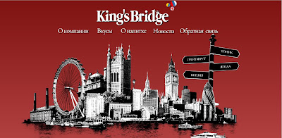

 analysis: very nice graphic design, motion, animation rollover effects and transition is very well designed and lively...i like this very much...
Sensisoft
www.sensisoft.com


 analysis: graphic is very nice, overall mood is there, animation in every page is different and lively, every page looks consistency, transition is well-designed.
Vanilla Splits
www.vanillasplits.com


analysis: art style is very nice, looks very realistic, navigation bar design is creative enough.
Nespresso
www1.nespresso.com


analysis: wow!!!hehe...layout design is very nice and creative, looks professional and high class, transition between every page is very smooth and realistic...sai lei...
____________________________________________________________________
html/CSS/Javascripts tutorials:
design tutorials:
In WEB DESIGN 2, our final project is about redesign our client's website which is chosen unluckily...hehehe...my client is PAPPARICH, a restaurant in Malaysia. I need to redesign their website by solving the problems in their website.
Here I will post some screen shorts of their website.


 problems should be solved:
1. navigation bar in each page is not consistency and the design is too simple.
2. overall color mood and art style is not match with their theme.
3. there is no title in each page.
4. no hierarchy in each page, either the images or paragraph.
5. Menu page is very messy, make the audience no more mood to continue reading.
_____________________________________________________________
competitor's website:
Oldtown
www.oldtown.com.my
Analysis: overall mood is very nice, design is very eye-catching, artstyle looks very class but modern, information is organized nicely.


Avista Restaurant
www.avistarestaurant.com
analysis: design simple but very nice, looks high class, layout designed nice, the organization of the information is very well.


Firewater Cafe
firewatercafe.net
analysis: layout design is simple but nice, hierarchy of information or each paragraph is well-organized, color mood is there.


Camilles Cafe
www.camillescafe.com
analysis: look at this website i really want to go there to have a lunch or what dy~~~^^overall design is very nice and eye-catching, have a very nice treatment of typography design and organize...very nice...


_____________________________________________________________
commercial websites:
King's Bridge
kings-bridge.com


 analysis: very nice graphic design, motion, animation rollover effects and transition is very well designed and lively...i like this very much...
Sensisoft
www.sensisoft.com


 analysis: graphic is very nice, overall mood is there, animation in every page is different and lively, every page looks consistency, transition is well-designed.
Vanilla Splits
www.vanillasplits.com


analysis: art style is very nice, looks very realistic, navigation bar design is creative enough.
Nespresso
www1.nespresso.com


analysis: wow!!!hehe...layout design is very nice and creative, looks professional and high class, transition between every page is very smooth and realistic...sai lei...
____________________________________________________________________
html/CSS/Javascripts tutorials:
- http://www.htmlcodetutorial.com/
- http://www.echoecho.com/javascript.htm
- http://www.javascriptkit.com/javatutors/
- http://csshtmltutorial.com/csshtmltutorial-htmllinkcodetutorial.php
design tutorials:
Subscribe to:
Posts (Atom)